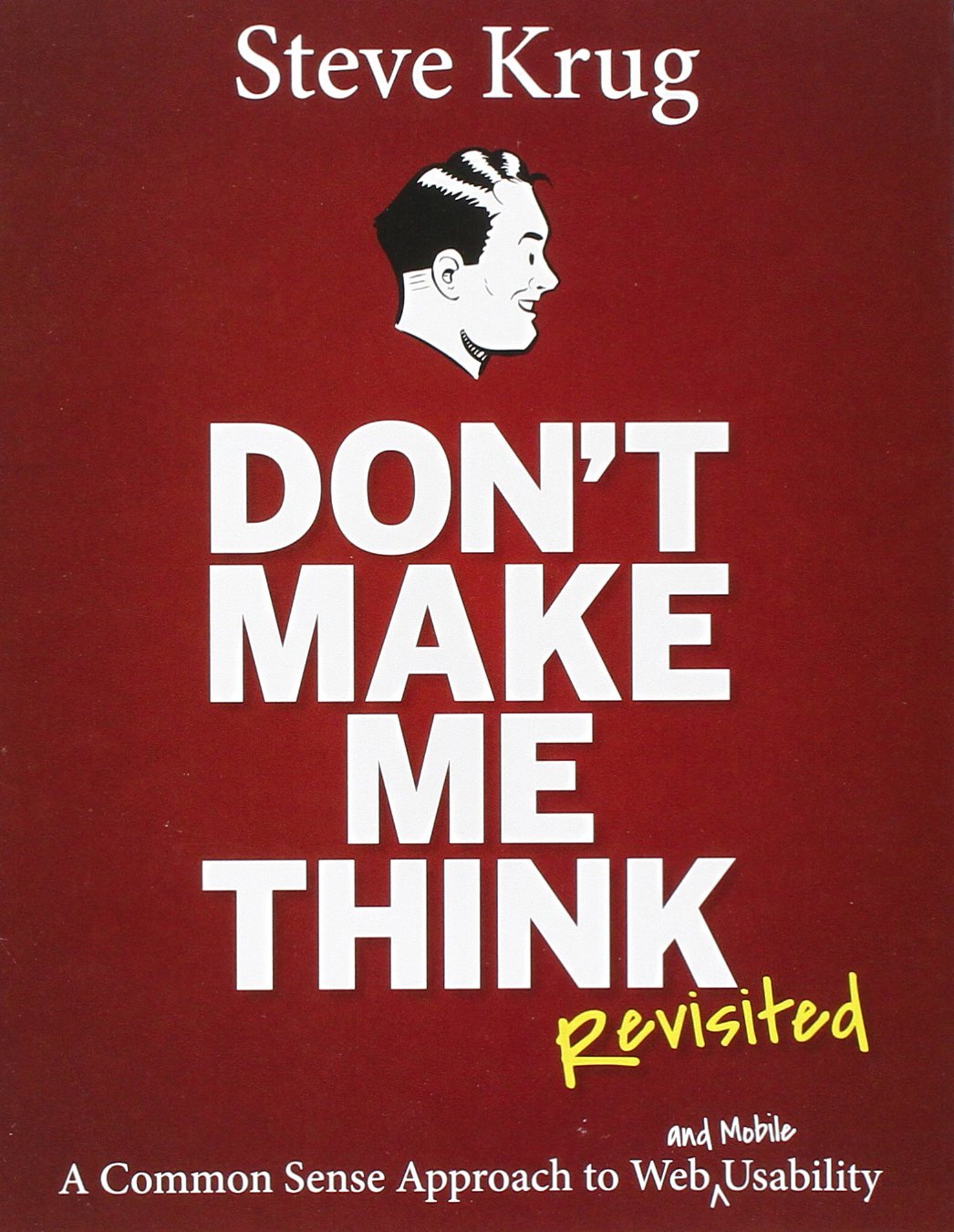
Don't make me think, Revisited: A Common Sense Approach to Web Usability
by Steven Krug
ISBN-10: 0321965515
ISBN-13: 978-0321965516
People often say that common sense is the most uncommon thing in the world. It is perhaps so, because things that are trivial are often not noticed. Something has to stand out for our untrained eye to notice it, but after that, it comes to us as too obvious, like 'why did I not see this before' effectively becoming common sense. This book introduces a few of those major things that developers and designers easily overlook, perhaps because of their familiarity with what they're doing. What comes as obvious to them, alas, isn't as obvious to the user and hence, the user has to think, which can be a hindrance for the overall business.
This book highlights a few of those quirks that we encounter while browsing websites, the nature of user, the philosophy that should be employed while doing such designs and above all, show us that we have done it all, as users of other websites, often unconsciously.
While it doesn't tell you everything, it does get you started on the right footing, say, it is the first step, and perhaps that is why it is also reported to be a mandatory reading in many grad courses on UX (user experience) design.
I took up this book because I literally suck at UI Design or usability. I am a developer, not a designer. But, doing things on our own has this advantage, or handicap, perceptions may vary, that we need to do everything ourselves. So, I wanted to know what obvious things am I missing. Turns out, I am missing out on a lot of things the sense of placement, space, layouts and aesthetics are not my forte. Plus, there is a wide chasm of what I expect users to do, and what they actually do.
That said, I too am as guilty of all those quirks of an internet user, say for example - we don't really read pages, we scan them, and if something catches our eye, like FREE, or SEX, or SALE, some of the words associated with rewards that our instincts are tuned to listen to, we plough in a little deeper.
Some things are obvious in a way that they are seldom stated. For example, character limit per line, I thought it did not matter. But certain research papers tend to point in the other direction. Thinking about it, even when the book is all about 'Don't make me think', which is from the user's perspective, I realized that it makes some sense. Actually, it makes a lot of sense. Even books don't have very long or very short line lengths.
Then, it discusses some roadmap for people like me who don't know what they want. That is to utilize the design patterns that have been in use. I know how I would like to go all bohemian while I reject each traditional design as 'too common' and as something that doesn't stand out, in the absense of anything radically new, it is me who is at loss of not having a good design, no matter how common it is. New things evolve, once we know old things. It would be too naive if not haughty to tick them off without knowing the reason why they are there. That is SOME lesson our cantankerous youth - the 'Ruck Fules' kind - must also take. These patterns have been designed, and refined since the time they've been used, read, since the advent of the internet and more than that, Apple Inc. They work because people are familiar with them. There is no point in creating something artistic, which has to make a user think 'now what? It sure looks nice, but I don't know what it is'. Internet is for information exchange, and that is why accessibility is a touchstone of internet design.
It deals not only with the accessibility issues for the normal people, but also promotes 'doing the right thing' by incorporating in design, aids to help the disabled too, for example, adding appropriate alt text into images, so that the screen readers can read them, since they cannot read images.
It also emphasizes the utility of user experience testing at all stages of design, since it is the user that we intend to serve through the design.
It is a short read, but was enough to get me started on thinking with a few new perspectives. Who is it for? Of course for people getting started in web design, and also for people who design things for general consumption.
P.S.: I really read it many months back, and somehow, this draft had been evading publication. But now that I've discovered it, I think it would be good time to revisit the book again and find something that I missed the last time.
And if you too would like to find a few things out and need a quick primer on what is so obvious that it doesn't even show, and are moved enough to buy it now, here's a link to Amazon. (The price is actually steep for such a small book, but...)
